|
|
|
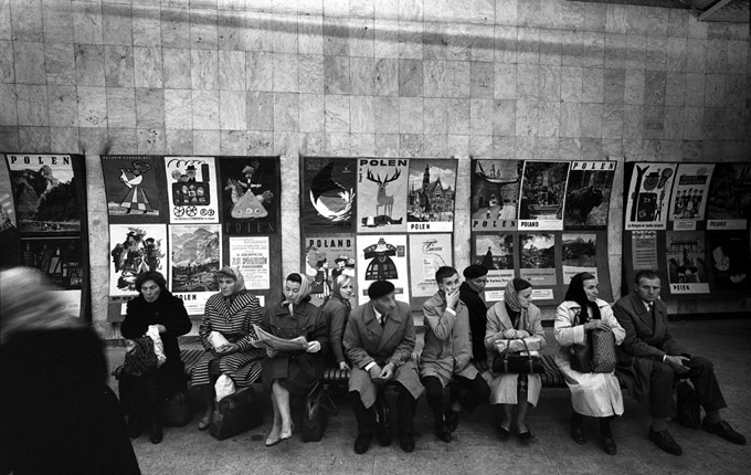
For a medium increasingly divorced from street presence, Polish posters enjoy an unexpected following lately and are being rediscovered in strange ways. On my rather serious site, there are more hits from art blogs than from anywhere else. One such net article: "50 incredible film posters from Poland" might have done more to popularize the subject than any show in MOMA. Then there's a blog which lets you design your own Polish movie poster, with the added benefit of hilarious machine translation. Another challenges the viewer to "match the Polish poster with the film" and comes complete with priceless comment section. Well, as long as the kids are having fun with them, they live.. The uniqueness of Polish film posters (and to a lesser degree, theatrical ones) lied in the fact that for 3 decades the artists controlled the content and form of an ad. It allowed unprecedented freedom of expression, created new sensibilities and divorced the medium from immediate and often depressing concerns of their Western counterparts : who gets the top billing, what font is approved and which side of Johhnie the Star's face is better than the other. It might have well been the longest period in modern commercial art history that the keepers gave away the key (albeit in a limited and marginal market), with consequences even now. The essence of Polish poster school was a desire to create a graphical synthetic view of an idea expressed by the advertised event. Waldemar Swierzy summed it up so : "Here's how I understand the idea of the poster: ... the theatrical poster has to be a synthesis of two hours, because it can not be told as in the theater, where we have the two hours sitting in comfort in the warmth. The poster is looked at in the passing, in the rain, in winter at the bus stop, in the crowd, so it must be only a signal, suggestive character for the passer-by to register ... " A lot of patronizing drivel had been written about the 'Polish School' of poster design being a 'product' of a 'resistance to Communism' or some such. That view, espoused by Western writers who don't know any better, and Polish ones (who should know better) had been omnipresent lately. No matter that the idea of art as an expression of political circumstance is par excellence a classic communist one. In fact, quite the opposite seemed to be true : free from commercial stranglehold, these artists produced brilliant works over an extended period of time. A lot of talented people found themselves in the right place at the right time. Like any artistic movement (or 'school'), it had its own dynamics, peaks and valleys. Indeed, some of the most accomplished works were political (pro-socialist). And now the fact that Polish film poster is extint, and had been so since 1989 when film distribution was privatized, serves as further and final evidence. The censorship debate seems irrelevant; aside from some agitprop films, it's hard to argue that the men with scissors had much to concern themselves with. One exception was the 1948 to 1954-55 period, when actual presentation mattered and "modernistic" style was frowned upon; even then however "social-realist" images were few and far between. The results this hands-off policy produced were often brilliant,
sometimes dreary and self-indulgent, often mediocre, but seldom
boring and - as a rule - deeply personal. It started with the pioneering work of a trio of artists in the 1940s. Henryk Tomaszewski, Tadeusz Trepkowski and Eryk Lipinski were the original graphic designers commissioned in 1946 by Film Polski (a State film distribution monopoly) to design film posters. Their work soon revolutionized this particular form of advertising. Rather than use the stereotypical images of movie stars and exclamation points, they employed a whole new arsenal of graphic interpretation to convey a shorthand essence of the film. Two terrific early (1948) examples are : Tomaszewski' Citizen Kane and Ostatni etap by Trepkowski. In 1948 the political climate changed, Socialist Realism was introduced and other styles were severely restricted. Few works from the 1949 -1953 period retained the high standards established earlier. In the meantime though, more designers were drawn to the field : Wojciech Fangor, Waldemar Swierzy, Jan Lenica, Jerzy Treutler, Roman Cieslewicz, Wiktor Gorka, Jan Mlodozeniec, Julian Palka, Franciszek Starowieyski, Jozef Mroszczak and Wojciech Zamecznik - to mention the absolutely essential names. By 1955 the Stalinist policies were history and - with the restrictions gone - the field exploded with brilliant, classic works. The golden period extended until 1965, more or less. Designs from the late 60s, while by no means regressing to the corporate hack of Hollywood, generally lost the freshness and boldness of the earlier pieces. At the same time, the variety of styles widened. Many new designers brought with them their own vision, spanning the spectrum from the lyrical impressionistic style of Maria Ihnatowicz, to the pop designs of Andrzej Krajewski; from the cyberpunk montages of Ryszard Kiwerski and Maciej Raducki, to minimalistic expressions of Bronislaw Zelek and Mieczyslaw Wasilewski. In the mid-70s to mid-80s, the 'Polish School' of poster design started suffering from atrophy of fresh ideas. Apart from the works of few artists who basically continued the previous trends, most posters from that period seem uninspired. In the 80s, the designs became politicized, with hardly any new designers entering the field. Some interesting trends emerged, signified by some works of Stasys Eidrigevicius and Wieslaw Walkuski, but overall quality of designs went rapidly downhill. Then came 1990 and the State monopoly ended. Suddenly the distribution of movies in Poland was taken over by Warner, Paramount, etc., and the Polish poster as we knew it ceased to exist. Nowadays, most films are released with the same sort of ad display as in the US - essentially a photo montage of stars with approved typeface. Very few designers try to continue their work, rarely issuing a very limited series of posters (300 to 500). These are never displayed on the streets but are sold in galleries. The artists worked to show off and the pool of talent was large enough to assure artistic quality. Of the 7000 + Polish film posters, at least a quarter could be described as very good, "awesome", 'cool' or whatever the vernacular of the times. Indeed the overall standard (despite some duds from the 70s and 80s) was consistently high. The established designers who had the first pick of titles were constantly nipped at knees by young upstarts who delighted in the opportunity for their work to be showcased in public places all over the country. The seniors were accomplished enough to command artistic respect though. The process was self-policing and here's how Zuzanna Lipinska - daughter of Eryk, one of the Founding Fathers of the movement - described it : "I worked as poster designer in Poland in the early seventies, mainly designing film and theatre posters. To become a film poster designer as a young art graduate, you had to become a member of the Artist Union, to start with. Then get your name on the list of potential designers and attend the screenings of the films, before they were released. After each screening, you put your name down on the list of people who saw the film, and then Mister Rog, who was responsible for giving commissions, would choose the designer." "The designer would be given a set of films stills. Obviously American, French and Italian films were more popular and the screenings were crowded. If the film was very well known, the commission was given to a well known designer, even without him having to attend the screening. We, young unknown artists, were left with Bulgarian, Romanian and similar films, but every opportunity to design a film poster was thrilling." "We had 2 weeks to do it. Posters were produced in 1:1 scale. In most cases the lettering was done by hand." "So once the poster was done, it was presented in front of the panel of 4-6 well known poster designers and they would either accept it or reject it. Sometimes they would give a "distinction" if the poster was very good - which meant an additional 50% on your fee. A fee for poster design was just below a monthly average salary in Poland, so it was quite good." "Sometimes they would ask for some corrections and changes. Sometimes they would reject it all together. All this was necessary to assure a high level of the design. If it was totally rejected, a new project was presented in a week." "In case of Polish films, the directors often would choose a designer themselves to do the poster, and they had the final word." "Posters were mounted or done directly on a stiff background, so they could be displayed in front of the judging panel. Each designer was given 10 copies of the printed poster. I am talking here about late 60s - early 70s - afterwards things were different." Despite the plurality of styles the posters shared a common characteristic : rather than ads they were a variation on a theme, an interpretation, a commentary. As an ironic reaction of sorts to so many 'arty' designs, there was even a short-lived, tongue-in-cheek trend with posters deliberately stylized to resemble Hollywood playbills. It is hard to speculate whether this form of advertisement
was more effective than the garden-variety kind. For one, no
pressure existed for the exclusive State distributor to push one film over
another. The system worked by word of mouth and the typical blockbusters
(Westerns and swashbuckling capers in the 60s, big war movies
of the 70s, action thrillers of the 80s) would find their clientele
no matter what the poster looked like. Many posters for the likes
of "Guns of Navarone" were quite pedestrian; or ironic,
as befitting a serious artist in need of a challenge presented
by more sophisticated films or, perversely, by unwatchable ones.
In fact, the best posters were often for very obscure titles. Of course, "2001", "The Birds", the
whole Westerns collection, could suggest otherwise,
but in the end it wouldn't matter. Selling or not, it was not
the main concern. It is arguable whether "The Cabaret" would
have a bigger audience if it was advertised with Lisa's 2 legs
instead of four, or if the fact that the film was a huge hit
had anything to do with any promotion or lack thereof. Commercially, Polish posters didn't fare too well in the West. Due to limited availability in the early period, these works were virtually unknown outside of Poland. Most were released in small, 3000 to 12000 first runs (4200 - 8000 average), with just a handful ever seeing additional printings. The great majority were used for actual advertising and very few found their way to private collections. There was no way of buying these works anyway; they had to be obtained from a friendly theater manager (or a guy who'd put them up on public billboards). As a result, most are hard to find. I personally know of no more than 40 large private collections worldwide, mainly in the US, Poland, Japan, UK, The Netherlands, Germany, Switzerland and France. Paradoxically, the rarity makes them wonderful collectibles : cheap because not well-known, yet with prices nowhere to go but up. There is no surplus of these classical works in Poland or anywhere else in the World. Prices vary from $100 - 250 (inexpensive, mostly 70s and 80s posters), to $250-500 (moderate, 60s and some 50s works of the better-known designers), $500-1000 (expensive, well-known pieces of very well-known designers), $1000-7500+ (the best-known, rare individual titles). In each category there is enormous growth potential. Most Polish film posters remain on the cutting edge of poster design even now, and are not just nostalgia pieces. Collecting tips / things to avoid : 1. Stick to the golden age (mid 50s to late 60s / early 70s) and pick a favourite designer(s) or a theme. Some artists continued their best efforts well into the 70s and beyond, but generally : late 60s seem tired, 70s - flat and uninspired, 80s - repetitive and boring and the 90s nailed the coffin shut. Anything pre 1955 will be worth having, if only for serious trades. 2. Almost all collectible pieces are in the A1 format. Some of the 40s original well-known B1-size classics have been reprinted in A1 in the 50s, and these second runs are actually more valuable. The format switch occurred again at the end of the 70s, and - almost without exception - all the 80s and 90s posters are B1. It'll be years before the (very) few of these will gain real value - now they are just wallpaper. 3. In the 80s, the matte paper on which most earlier posters have been printed was substituted with cheap glossy stock reminiscent of the Western "movie posters". Also, there was a logo switch, from the earlier "CWF" to "Poltel". Stay away ! 4. In addition to the above no-no's, a presence of English,
French or German titles (sometimes coupled with the absence of
Polish ones) is an indication that the poster was intended as
a promo for foreign release, usually in the 80s, always in the
B1 format. These posters are generally much less valuable than
the Polish originals. |
|
One of the Great Secrets of Twentieth-Century Pop Art Pulp form, thumbnail allusiveness, hyperbole, uncouth syntax-this much we all understand about movie posters, truly a public art form only Papuan tribesmen could claim to be ignorant of. Until we go to Poland. Outside of its fevered circle of cultists, the authentic phenomenon of Polish movie posters remains one of the great secrets of twentieth-century pop art. There are large-format books published here showcasing Italian movie art, Japanese posters, American exploitation graphics (no shortage of these), and, remarkably, amateur posters for Hollywood films made by Ghanaian artists on secondhand flour sacks. But none of the Polish. Nowhere else but in Poland has the very concept of movie-poster design gotten such a radical overhaul, and nowhere else has it so persisted at identifying itself as a freestanding object. The primary philosophical singularity at work in the tradition of Polish movie posters going back at least to the '50s is this: The poster art need not visually suggest the movie in question in any concrete way whatsoever. In fact, direct visual reference to anything in the film is often shunned. The poster should at most semiconsciously evoke the thematic feeling of the movie (or its title-in many instances, Polish posters seem to be created with abject ignorance of the cinematic work itself). The artists chosen are prized for their intensely idiosyncratic visions, to which the movie-poster form and the marketing exigencies of a particular film must defer, not vice versa. |
|
The Legacy Of Polish Poster Design Before the era of globalized entertainment made movie posters look the same in every country, Polish artists were creating their own versions for the internal market. What resulted was a whole school of artists trained in the art of the poster. The 50's and the 60's: The Golden Age The Fifties and the early Sixties mark the Golden Age of the Polish poster. Like everything else, the film industry was controlled by the state. There were two main institutions responsible for commissioning poster designs: Film Polski (Polish Film) and Centrala Wynajmu Filmow CWF (Movie Rentals Central). They commissioned not graphic designers but artists and as such each one of them brought an individual voice to the designs. The School of the Polish Poster is therefore not unified but
rather diverse in terms of style. It wasn t until the Mid-Fifities, Second, the state wasn t concerned much with how the posters looked. Third, the fact that the industry was state-controlled turned out to be a blessing in disguise: working outside the commercial constraints of a capitalist economy, the artists could fully express their potential. They had no other choice but to become professional poster designers and that s why they devoted themselves so thoroughly to this art. The Polish film poster is artist-driven, not studio-driven. It is more akin to fine art than commercial art. It is painterly rather than graphic. What sets the Polish poster apart from what we re used to see in the West is a general disregard for the demands of the big studios. The artists requested and received complete artistic freedom and created powerful imagery inspired by the movies without actually showing them: no star headshots, no movie stills, no necessary direct connection to the title. They are in this regard similar to the work of Saul Bass, a rare example of a Hollywood artist who enjoyed total freedom from the studios. Next to a typical Hollywood film poster with the giant headshots of the latest movie star and the title set in, you guessed it, Trajan Pro, the Polish film poster still looks fresh and inspiring today. |
|
The early post war years were the period of friction between two currents in Polish poster art. On one side, a group of graphic artists of the older (pre-war) generation who wanted to return to the realistic manner of prewar poster art, and on the other side, a group of younger artists, influenced by persons from the only centralized postwar institution dealing with the distribution of films throughout Poland, Film Polski,; began to design posters radically different from those published until then. A very new and different art world emerged. Polish art historian, Zdzislaw Schubert, described these latter, younger artists: "They had been educated after the war and were unburdened by experiences of the interwar period. They had no professional training in poster design: they had been educated mainly as painters, sometimes architects. This made them tend to translate what they had learned in their studies to their poster work. Among the foremost of that early wave were Henryk Tomaszewski, Tadeusz Trepkowski; and Eryk Lipinski, who demanded complete artistic freedom, declaring: "any self-respecting graphic artist does not do film posters". Of that generation (rapidly shedding realistic styles), one recognizes individuals now acclaimed in Poland and beyond: Roman Cieslewicz, Jan Lenica, Jan Mlodozeniec, Franciszek Starowieyski, Wlademar Swierzy. Numerous scholars note three major generations of development in postwar Polish poster art, but together with small circles and maverick individuals, all are lumped as a distinctive "School of the Polish Poster". In reality, it was not so much a school, as a diverse flowering which shared common cause and circumstance, aberrant restraints; and yet: respect, wide interest, and peculiar opportunities. It flourished under an ideological system. Consumerism and Capitalism were virulently condemned, and 'sex appeal' virtually banned (.. ) unliveable constraints. (In the years 1949-1957, American films even vanished -- totally -- from Polish screens.) Here, a renaissance of quality was forged by conflict: between each individual's desire to question and explore, and The State's pressure to conform and be used; between the artist's experiments and the demands of communication". Art historian, Alan M. Fern, in his book Word and Image (MOMA:1968), praised the postwar Polish poster: "..the quality of imagery, draughtsmanship, simplicity, and free association of visual motifs is unique; Polish designers have explored the possibilities of freely designed letters and informal calligraphy more thoroughly than anyone else". Fern felt that much Polish poster art seemed "more closely related to Savignac than to the Bauhaus" asserting that many of these artists turned from "the niceties of geometric organization, or suiting their designs to machine production". He concluded that: ".. their art comes out of a vital tradition of book illustration and painting, rather than from industrial design or architecture. It can also be related to the growth of the film art in recent years, and to a lively teaching in the many art schools in Poland". Earlier, for historical reasons, many Polish artists had been
deeply involved in the Russian avant-garde. Others at the same
time monitored Munich and Parisian art centers. Steven Heller, editor of the American Institute of Graphic
Design's AIGA Journal of Graphic Design, summarized all that
meant: " Americans understood, of course, that these images mostly for cultural events did not have to sell
to specific demographically identified consumer groups, or please
the chairmen of major corporations, or appeal to the special
interests. But they did have to transcend (and fool) a regime
that was suspicious of individual expression. In this way, Polish
poster artists overcame some remarkable challenges and American
designers looked enviously and admiringly to the Polish poster". For decades, despite an exceptional few such as Push Pin Studios, Paul Rand, and Herb Lubalin, American graphic art and design remained conventional and narrowly utilitarian. Yet, as Heller further observed, the Polish art poster ultimately had a profound, invigorating influence in the United States: It wasn't until 1970, with the launch of The New York Times Op-Ed Page, that a Polish poster vocabulary seeped into American design and illustration. The Times wanted to innovate a new illustration style -- a more cerebral, symbolic, metaphoric approach -- and rather than create something from whole cloth, it borrowed and reinterpreted for newspapers what the Polish artists had done for posters. Surrealism and fantasy were used as a means to comment on political and social issues without being literal -- and without hitting the audience over the head. The 1950s and 1960s represented a peak for Polish poster art, although it continued to innovate and produce surprising images well into the 1980s. Zdzislaw Schubert saw that period as the height of painterly poster art, but observed a parallel appearance of excellent work as a reaction against it, and in such work he underscored "..a preference for modest handling of color, a resignation from the use of color masses for their brightness values, the use of blocked arrangements of lettering from printer's fonts". Schubert devoted particular praise to Bronislaw Zelek, represented in this exhibition by Ptaki (1965) for Alfred Hitchcock's The Birds (1963), and Zabic Drozda (1965) for Robert Mulligan's To Kill a Mockingbird (1962). Zelek's Zbieg z Alcatraz (1970) for John Boorman's Point Blank (1967) confirms the potency of that contemporary. A terse visual asceticism and strong compositional use of typography distinguishes work by Leszek Holdanowicz and in this showing his Incydent (1970) for Larry Peerce's 1970 film is immediate, striking. Another artist exemplifying such newer trends was Marian Freudenreich. His Ameryka, Ameryka (1965), for Elia Kazan's 1963 film, Msciciel (1975) (Polish for avenger), a poster for Clint Eastwood's High Plains Drifter (1973), are equally engaging. New approaches and greater strengths appeared in the mid-Sixties -- despite the influx of foreign Pop and Neo-Secession (revival Art Nouveau) trends, although at the time these appeared a seductive threat, a crisis. Zdzislaw Schubert asserted: "Many artists could not adapt to the new situation. They either continued an already ossified formula or they unreflectively adopted motifs drawn from pop art or, more precisely, from re-workings of comic-book style. Our poster art was threatened with the loss of its native identity, crucial to its world standing. Only the strongest individuals managed to survive this critical moment, weaving together new impulses with their previous experiences and tradition". The 1970s witnessed the full maturity of Polish mastery in this artform. Polish art historian, Krzysztof Dydo, names among this poster art's middle generation: Jerzy Czerniawski and Eugeniusz Get Stankiewicz. These artists, who came to the fore during the Seventies, often typify the modern Polish poster for many throughout the world today. At this time, a new life came to this artform; much of it driven by highly gifted art academy professors such as Mieczyslaw Gorowski, Lech Majewski, Grzegorz Marszalek, Marian Nowinski, Wladyslaw Pluta, and Mieczyslaw Wasilewski. Still these posters seize the eye and stir the mind. They are not mere ephemera. Young students, working men, just passers-by, would often offer modest sums to those pasting them. Some gathered significant collections of an 'Art for the People.' Those works today are even more prized. They are fine art. What they have in common is high quality and a purpose. But they are more a decades-long event than a school or movement. More surprisingly, despite politics, changing circumstance, accelerating trends, the work of each succeeding artist remains his signature. Vocabularies alter; content shifts; there is experiment and growth. But an individual's work is recognized at once, unmistakably. This art still holds its force. How and why? In many countries, for long periods, posters favored a 'menu'
approach. They followed 'movie stars' -- manufactured personalities.
They merely illustrated scenes... and then loaded in the type:
credits, quotes, and hyperbole. Warsaw and Hollywood were galaxies
apart. Polish artists sought the content of the film, often its
rationale for being made. Elsewhere, words and marketing made
the rules. In the U.S., actor contracts even held a "likeness
clause" (a Pay for Painting Me demand). |